
 The more I look at those new iOS7 icons, the better they become.
They may look “odd” to some (and downright confusing or juvenile to a few of the more superficial commentators), but they are extremely clever and do a number of design “jobs-to-be-done” very well.
Firstly, they have a playful colour palette that makes them leap from the screen. It’s a modern, fresh and vibrant set of colours that sets iOS7 apart from the overtly “skinned” techno-isms of Android and the “flattened consistency… above all else” of Windows 8. iOS7 has colours bursting from the screen… and is all the better for it!
Secondly, the icons are all deliberately “different”. They refuse to conform to what is expected from icon sets in this day and age. Commentators have seen this as hasty incompetence and a failure to use the right “unifying theme”… but I see it differently. The varying shapes and lines of the iOS7 icons are an effort to re-balance and roll-back the touch device icon towards fulfilling the actual job it needs to do.
Jobs to be done
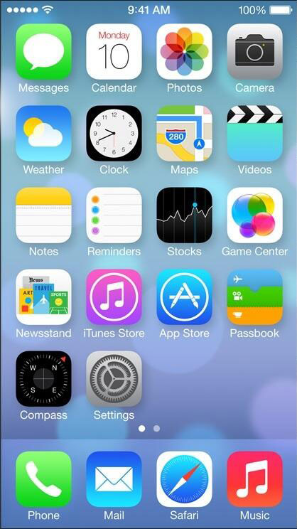
What is an icon supposed to do? At the very simplest level, it needs to instantly stand out and identify the app to the user.
I believe that the new spacing and updated shapes of the iOS7 icons are a clever exercise by Apple in forcing the brain to do a double take when scanning the icons. To me, these new icons add deliberate visual “snags” or imperfections within the designs that catch the eye as you pass over them.
To this end, I think each of this beta set of icons is very good at standing out against each other (with a few little exceptions). They use the colours and shapes in jarring (but carefully designed) ways to make individual icon recognition quicker and easier. They are perhaps closer to becoming the true digital road signs for the 21st century… crisp; approachable; informative; designed to stand out to a fast moving user… but not with a primary goal of being attractive.
I think Apple has been very brave in trying an approach that deliberately creates seemingly “ugly” icons that jar and clash with our expectations in order to further the ultimate purpose of the icon – to stand out quickly and get pressed!
There is also an “Icon-is-as-app-does” feel to the designs. The settings icon is intricate because settings is a complex beast; Game centre SCREAMS juicy casual gaming fun; Stocks is a bit… dull; Photos is vibrant and full of movement; The camera is simply a camera. Instantly recognisable (unlike the fancy lens rendering of iOS6).
It’s a lesson in design semantics… Just because an icon is designed to within an inch of its life (or is part of a perfectly unified and consistent theme) doesn’t mean it’s a good icon. Leave the showing off, the monolithic themes and the forced consistency to cydia theme packs (and Winamp in 1998). THESE icons have a job to do.
Old and New
![]()
Look at the old icons on the right. See how each old icon shouts “look at how intricate I am, and how much work went into making me”. The old icons are anchored down with textures and excessive details that clock up those fancy design man-hours… but actually they confuse a glancing user.
For the purpose of quickly identifying an App, the old icons are not so great (and they clash with both the background and each other). This old intricate glossy icon style led to countless copycat app icons that pushed the boundaries of “prog-design” to new extremes (meaning you basically had to read the text under the prog-icon to know what it was. Fail!)
Now look at the new icons. They do their job and they do it well. The jarring simplicity of design makes them instantly recognisable – for better or for worse.
These new icons also work far better AS ICONS in the very situations that are likely to occur with a mobile device. Just see how much easier they are to identify quickly on the move (and, crucially, in bright sunlight). The old icons are TERRIBLE in these situations. They all seemed to have gradually moved towards a strange design language that was more about showing-off (rather than the primary purpose of identifying the app). There may be branding or other reasons and arguments for this, but it doesn’t make it right!
The Bad and the Ugly
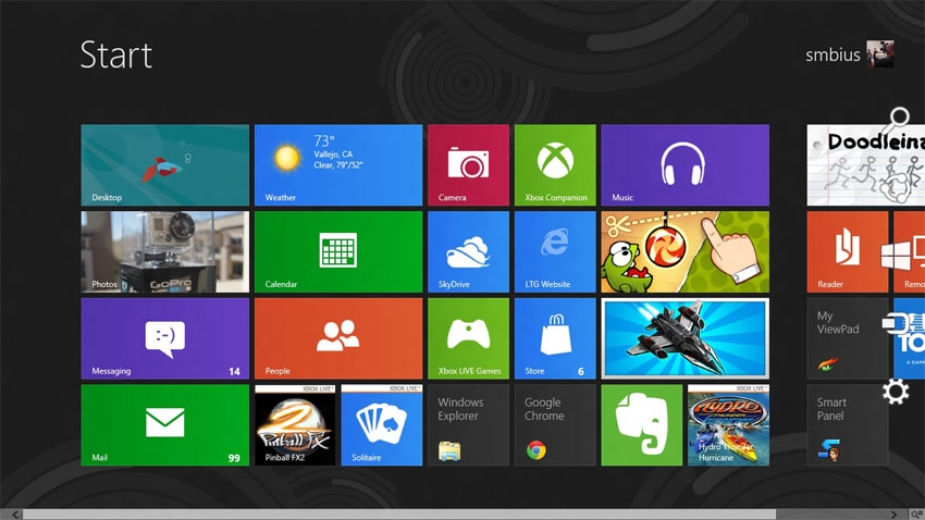
Let’s compare with the much hailed competition. Look at Windows 8 from the perspective of quickly identifying an an app. Ugh. The designers have allowed the goals of themed consistency and user customisation to create a bit of a mess. It’s a design theme demonstaration that ran out of ideas (and purpose) once it was applied to the real world.
And Android is just terrible…
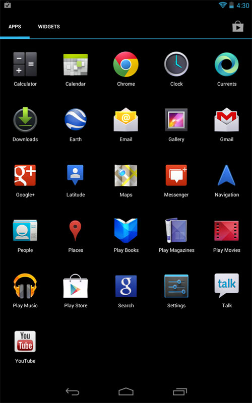
An unlovable, po-faced mess of kidnapped desktop icons with no purpose or goal.
Thank goodness for iOS7! I’m really glad there is someone left in design willing to sacrifice superficial forms and legacy constraints for a fun but functional relevance.
There will be plenty of design tweaks and changes as the final release nears (you KNOW some of these icons are still placeholders!). No doubt there will also be innumerable complaints from commentators before and after the release (the technology community seems to love their rigid design rules and safe paradigms), but what a refreshing change the new iOS design is.
Fun, different, challenging, un-afraid… iOS7 is going to be great!
You must be logged in to post a comment.